date
July 10, 2025
My role
Graphic Designer
Timeline
3 months
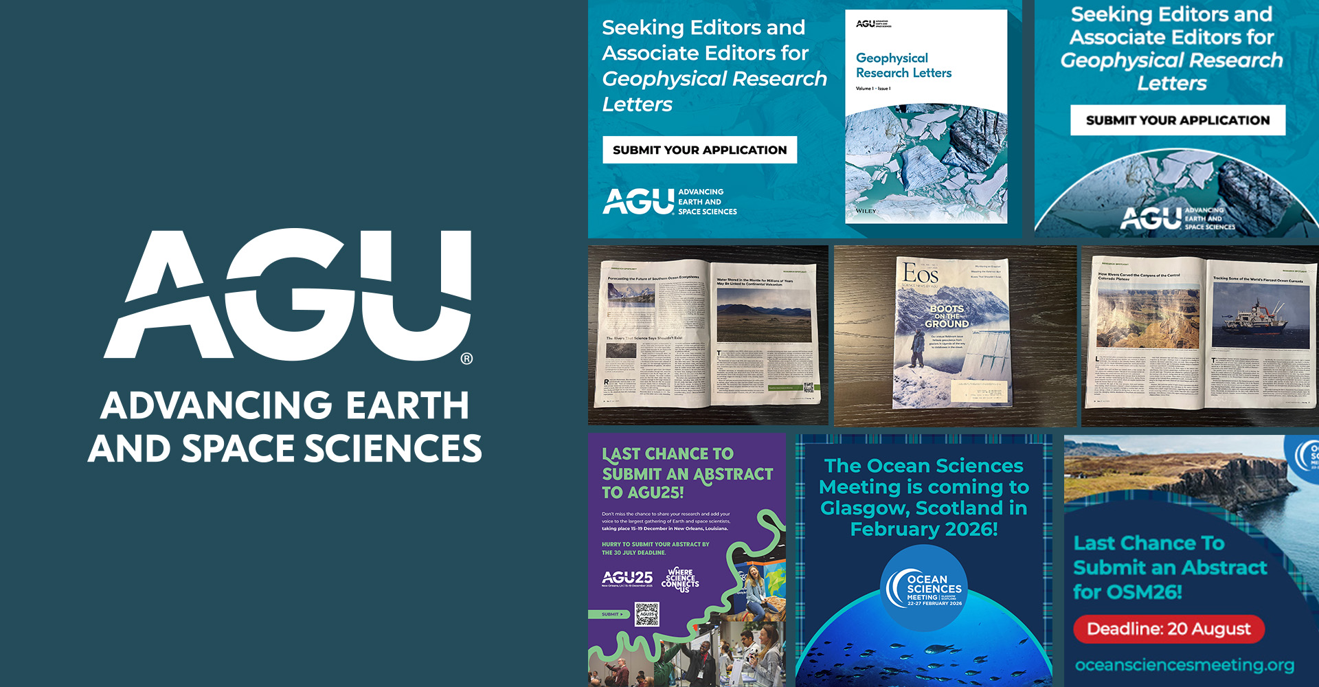
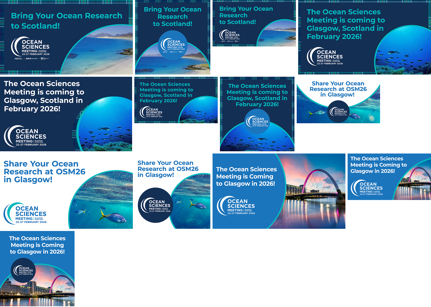
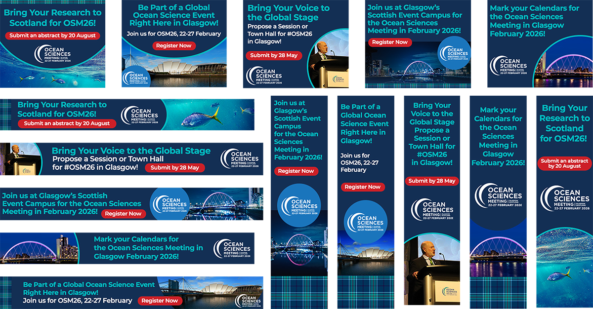
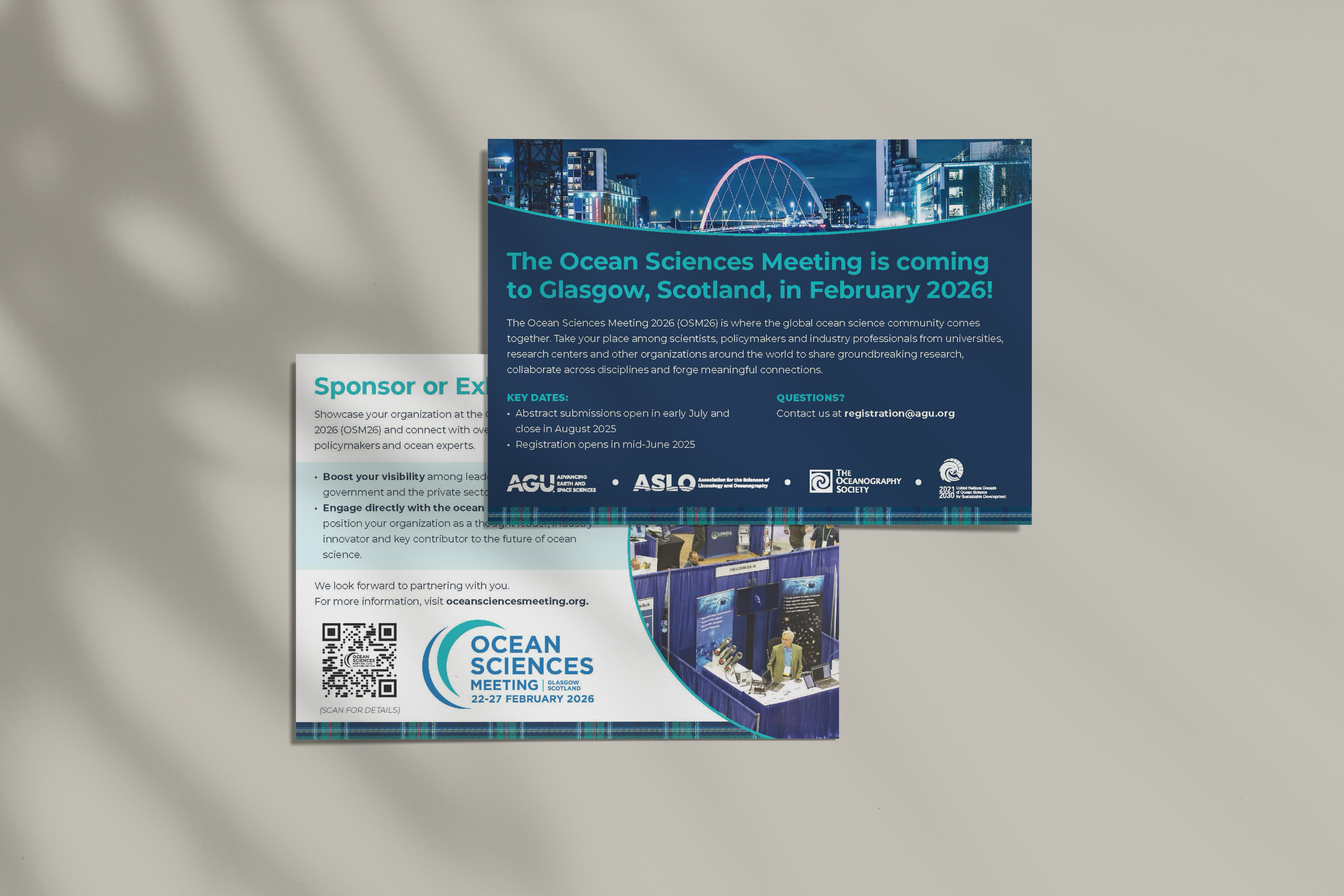
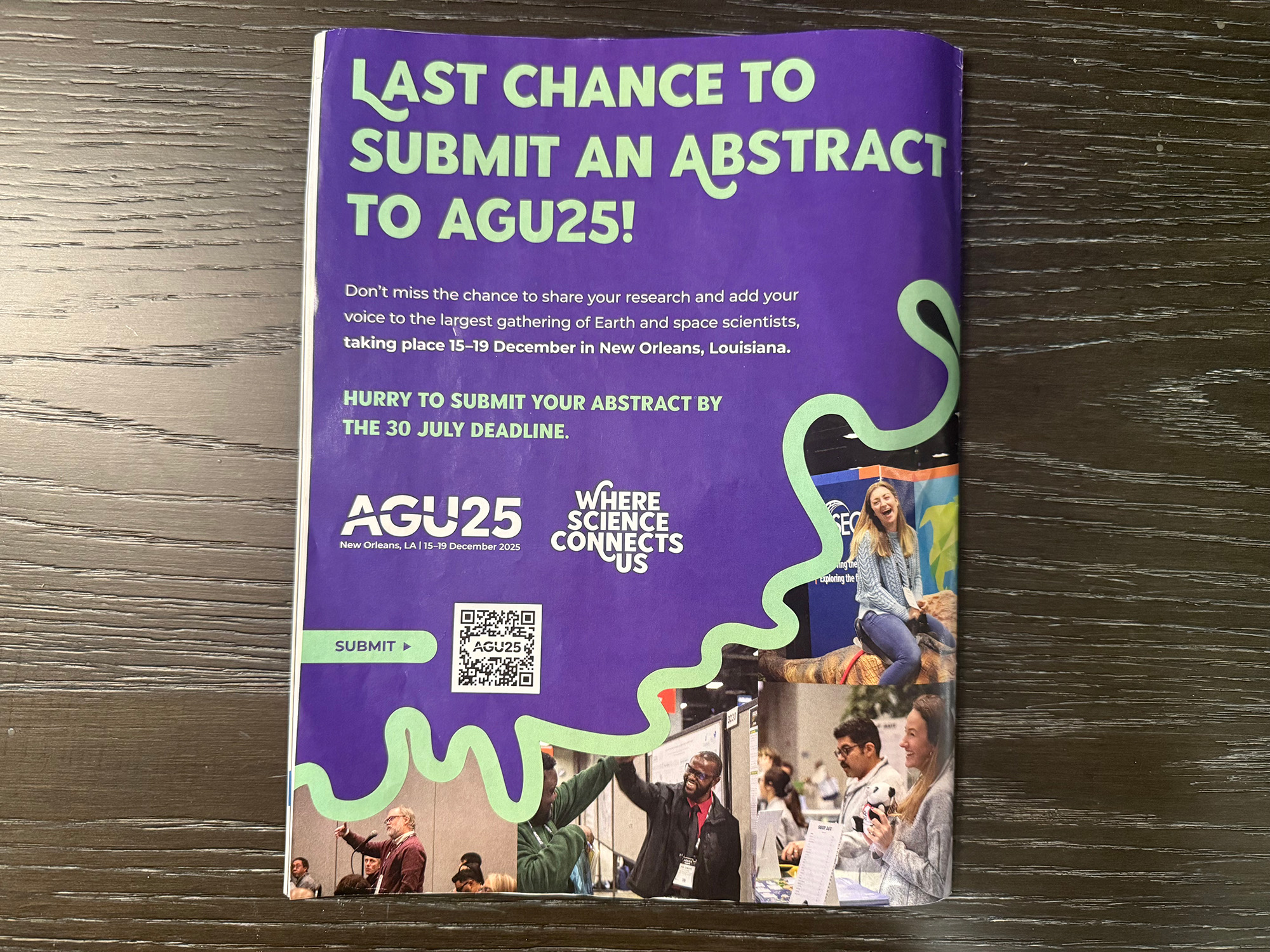
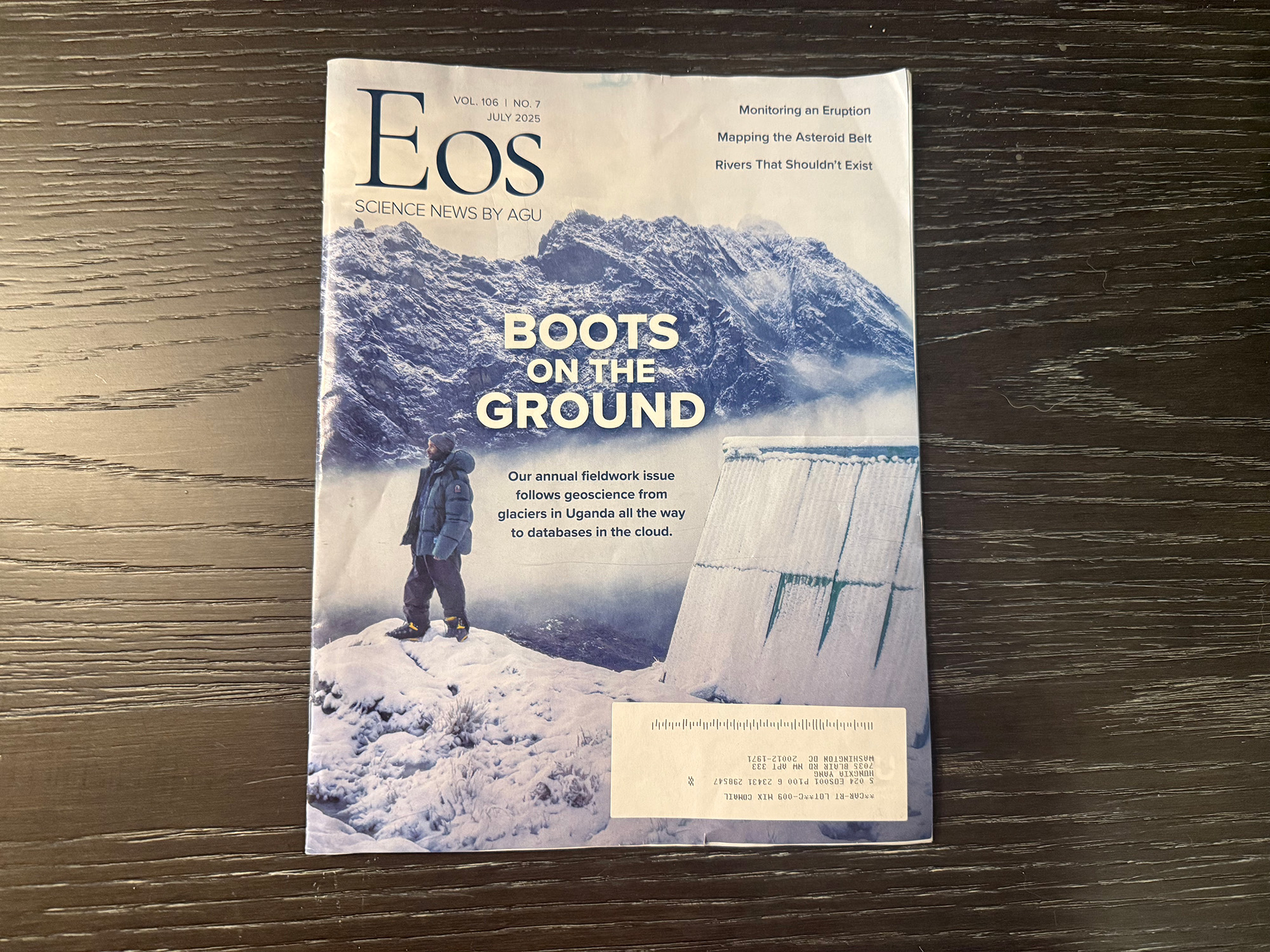
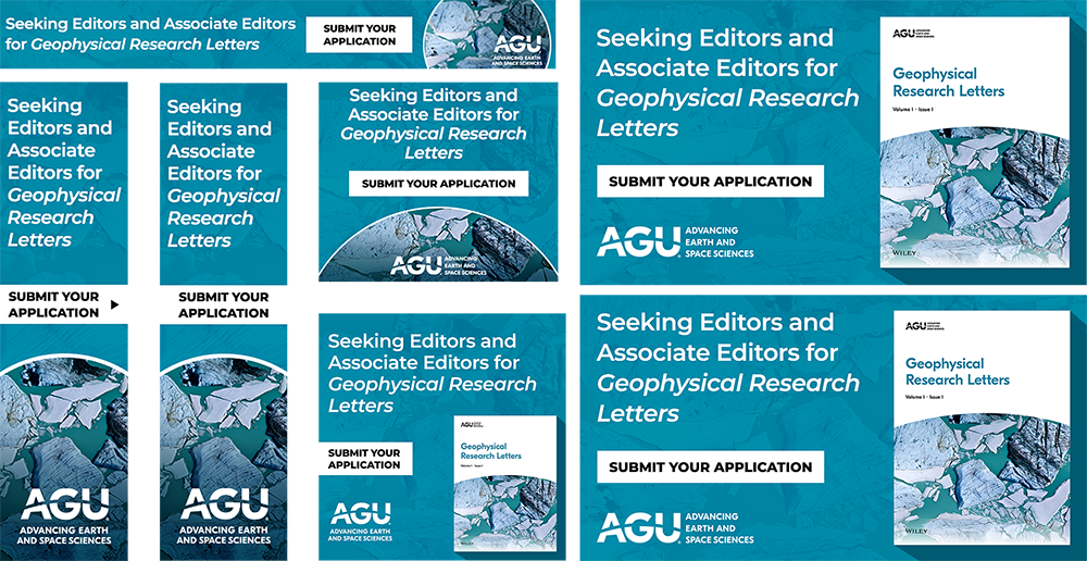
At the American Geophysical Union, I designed Eos magazine layouts and created marketing assets like digital ads, cover concepts, event merch, and certificate templates, ensuring everything aligned with AGU’s brand and communication goals.
To design clear, engaging visuals that help AGU share Earth and space science and promote its events and global meetings.
challenge
Solution
Parents of Seniors Students.
They need Support with college financial planning, like loans and grants, to ensure family stability, along with tools to stay engaged in their children’s education and manage work-life balance.
How might we redesign the U.S. Department of Education website to create a more user-friendly, accessible platform for parents, students, and educators, ensuring easy access to critical information on student loans, grants, and educational resources?
To gain user insights on the usability and clarity of the U.S. Department of Education website. We aim to understand their challenges, preferences, and needs when accessing information on financial aid, grants, and educational resources.
Navigation
Content Organization
Language & Accessibility
Objective
Key Tasks

Key Takeaway
Users find it hard to navigate the U.S. Department of Education website due to confusing sections, too much text, and unclear links. Simplifying the navigation, adding clearer visuals, and making language settings easier to find can help users quickly access important information about grants and loans.
Navigation
Hard-to-find language settings, broken links, unclear paths, and overwhelming buttons/categories.
Information Clarity
Unclear terminology, and lack of concise explanations make it difficult for users to find relevant information quickly.
Information Overload
Heavy text, difficulty selecting correct links.
Visual Design
Distracting colors, lack of engaging icons/carousels.
External Links & Terminology
Confusing redirects, unfamiliar terms (e.g., FSA ID), translation challenges.
In our usability testing, we observed how users navigate the DOE website, especially when searching for financial aid information. Many struggled with confusing navigation, too much text, unclear differences between grants & loans, as well as overwelmed information. To better understand these challenges, we created Maria’s persona—a parent managing her child’s education finances, representing a key user group.

Maria Gomez, a 46-year-old office manager, seeks student loans and grants for her child's college expenses. She's tech-savvy and involved in her child's education but worries about the financial impact of debt and is unsure where to start with grants.
Maria’s challenges with managing college expenses and navigating financial options highlight the need for clear, simplified information on grants and loans. This insight informed our website redesign by focusing on:

Our competitor analysis by Patrick (team memeber) shows competitors use dynamic visuals but suffer from clutter or dullness. The redesign will focus on clear navigation, balanced visuals, and engaging aesthetics for a clean, user-friendly homepage.

Competitor analysis form by Patrick

The U.S. Department of Education website faces key usability and accessibility issues, including inconsistent navigation, excessive links, lack of error recovery in the search bar, missing alt text for images, poor color contrast, and inadequate accessibility features like WAI-ARIA attributes. Addressing these challenges with clearer navigation, simplified content, and accessibility improvements will enhance user experience and inclusivity.
The "Student Loans, Forgiveness" section struggles with jargon, inconsistent link styling, scattered information, and missing definitions. Accessibility issues include lack of alternative text, poor contrast, and insufficient ARIA attributes. Centralizing information and improving design and accessibility will greatly enhance usability.


The "Grants" section of the U.S. Department of Education website highlights several usability and accessibility issues. Usability concerns include jargon-heavy language, inconsistent link styling, a missing email icon, and uneven spacing in bullet points.
Accessibility gaps involve missing alternative text for buttons, insufficient guidance for external links, and the need for larger buttons to support users with mobility impairments. Addressing these problems with clearer language, consistent design, and accessibility improvements will significantly enhance the user experience.
This wireflow shows the user path through the U.S. Department of Education website, focusing on accessing student loans and grant applications. Key observations from our UX/UI research include:

We conducted usability testing to uncover navigation issues and confusing instructions in the grant application process. These insights helped us improve the website’s clarity, accessibility, and user experience.


Usability testing plan

Usability testing report
Testing revealed confusing navigation, dense content, and visual distractions. Users struggled with broken links, unclear sections, and overwhelming text. These findings guided us to simplify navigation, reduce text, and improve visuals for a smoother user experience.

Pain points data
Card Sorting
After synthesizing the initial usability data, we moved into the ideation phase to brainstorm design solutions within the project scope. This process allowed us to develop a clear and user-friendly structure for the website, ensuring users can easily find and understand information.
1. create cards & Shuffle
Random content cards were created for Student Loans, Grants, Homepage, and Footer sections. The cards were shuffled to eliminate bias.
2. group & Label
Participants grouped related cards and labeled categories. For example:
3. structure
Groups were organized into a clear hierarchical structure:

Card sorting process on Figjam with the team
Site Map & Information Architecture
This sitemap shows the restructured navigation for the U.S. Department of Education website. Key sections are clearly organized to improve user experience.
This structure simplifies navigation by grouping related content, making it easier for users to find loans, grants, and resources. The clear organization supports an intuitive experience, reduces confusion, and helps users access key information quickly.

Wireframes
As a team, we worked together to create the initial wireframes and designed simple interactions to quickly test usability.

Feedback
During this process, we noticed several important areas for improvement:

Top navigation bar
The navigation wasn’t visually noticeable enough, so users might overlook it.
Hero Banner
The hero banner on the homepage felt plain and lacked interactive elements to engage users or encourage actions.
Press Release Section
The press release area needed clearer separation from other sections to avoid users accidentally clicking on it.
Secretary of Education
The clickable areas in the Secretary of Education introduction weren’t clearly marked, which made it hard for users to know they were interactive.
Student Loan Interface
The buttons on this page were too large, taking up unnecessary space and making the design feel unbalanced.
High-fidelity prototype
In the iteration phase of the DOE project, our team refined the designs based on feedback from the initial design phase and usability testing. We improved wireframes, streamlined navigation, and enhanced the interface to better meet the needs of students and educators.
This iterative process allowed us to optimize visual design and interactivity, delivering a more accessible and user-friendly experience.
Key updates included:

High fidelity prototypes
Mobile device design
These mobile wireframes are adapted from the desktop design, ensuring a seamless transition to smaller screens. Starting with desktop allows for establishing a clear information architecture and visual style, which are then streamlined for mobile. This approach ensures feature completeness, consistent branding, and an efficient, user-centered experience on all devices.


The Nittany Lions' primary colors are blue and white. The deep blue is often referred to as "Penn State Blue." The simplicity of the blue and white color scheme contributes to a clean and classic aesthetic. The team utilizes a clean typography style in their design materials, the design style of the Penn State football team is characterized by simplicity, tradition, and a focus on core elements.
The Buckeyes' primary colors are scarlet and gray, scarlet represents passion, energy, and strength while gray adds a touch of sophistication and balance, The team utilizes strong and bold typography in their design materials, design style embodies strength, tradition, and a sense of prestige.
The Wolverines' primary colors are maize (bright yellow) and blue. Maize is a distinctive color that symbolizes the University of Michigan and is instantly recognizable. The team utilizes classic and bold typography in their design materials. the design style of the football team is classic, elegant, and steeped in tradition.

This internship taught me how to design with clarity and consistency across both print and digital platforms. I learned to collaborate with marketers and senior designers, follow strict brand and proofing guidelines, stay organized under tight deadlines, and use design as a tool for visual storytelling. Most importantly, I began to explore how design is not just a service, it's a form of communication that shapes meaningful experiences for people.
View the Website


Crafted with code, coffee, and a little bit of magic. ✨ © 2024 Stacey Yang.
